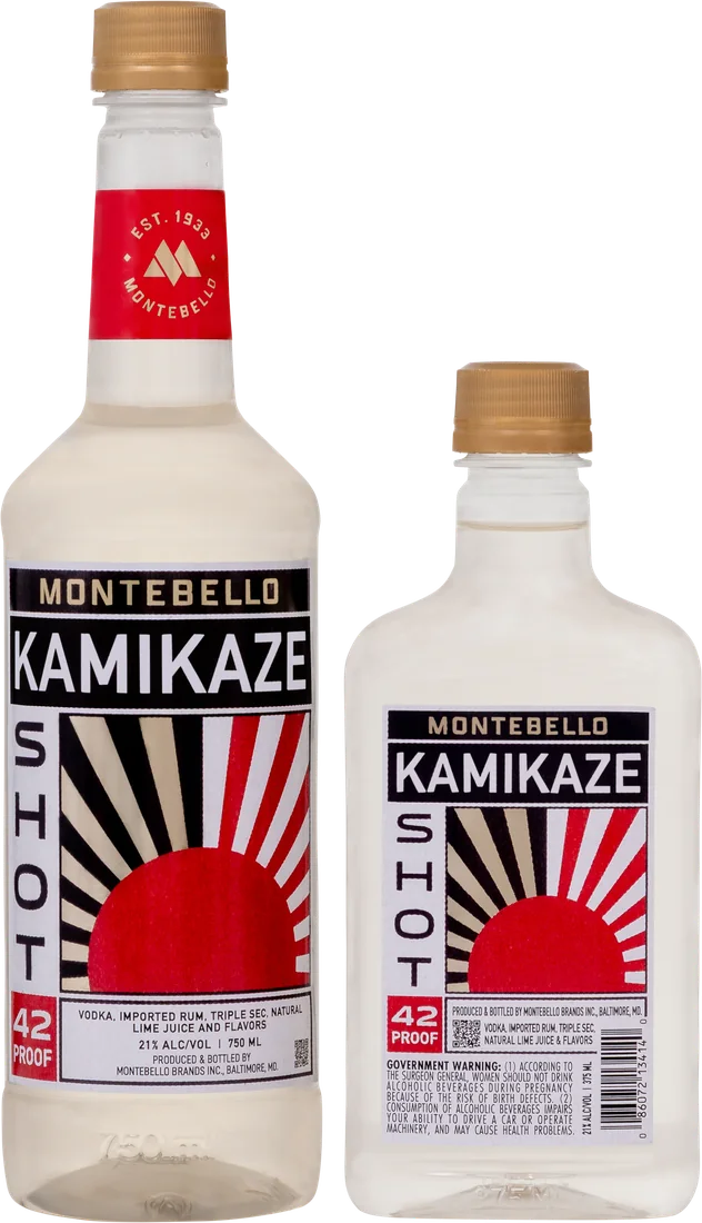
We teamed up with CF Napa Brand Design to give Montebello Kamikaze a new look. Their case study takes a closer look at the choices behind the bottle, from the artwork on the front to the Montebello mark on the neck.
The illustration takes its cues from Japanese woodblock prints. Gold accents pick out the Montebello logo and rays of the sun, while bold lettering and a flash of red make the name and 42 proof (21% ABV) easy to spot. The neck label brings the bottle in line with the rest of the Montebello lineup.
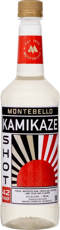
Thanks to the CF Napa team for sharing the work that went into the label. See the artwork up close and read how the design came together.
Read CF Napa's Kamikaze packaging case study
Please enjoy responsibly. For adults 21 and older.
Explore the collection Back to the blog